Sonic R Review

*Review based on Sonic R’s release as part of Sonic Gems Collection on Nintendo GameCube*

Despite being the “fastest thing alive,” Sonic has always been playing a game of catch up with Super Mario since day one. Despite Sonic’s early titles and a handful of the blue blur’s other adventures over the years achieving their own sense of timelessness, Sonic never did catch up with Mario. If there is one genre that seemed like Sonic would, by default, have the upper hand on Mario, it would be the racing genre. Sonic is a character built around his speed. Taking the series and adapting it into a racing game seems like it should have had minimal bumps in the translation.

Which is why it’s both dumbfounding and hilarious that Sonic R – the first Sonic racing game on a home console – is an utter disaster, and one of the worst games Sonic has ever appeared in (and boy, is that saying something).

Depressingly, Sonic R was the only exclusive Sonic game released on the Sega Saturn, with the two other Saturn Sonics, Sonic 3D Blast and Sonic Jam, being a port and a compilation of the Genesis Sonic titles, respectively. Although the Saturn was otherwise a stellar and underrated console (possibly my personal favorite from Sega), the fact that Sega’s biggest franchise only managed to pop out this turd of a game on the Saturn may have had something to do with the console’s short lifespan in the midst of the Sony Playstation and Nintendo 64.

“My eyes! The goggles do nothing!”

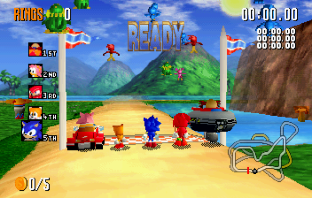
As stated, Sonic R was a racing game starring characters from the Sonic the Hedgehog series. Unlike other Sonic racing games that would follow, most of the characters run on foot. That may sound like it makes sense, since Sonic can run at the speed of light, and Knuckles and Tails are inexplicably just as fast (and, bizarrely, Dr. Robotnik has continuously outrun the blue hedgehog). But it ends up having disastrous results, as developer Traveller’s Tales apparently had no idea how to implement the traction and physics of running characters.

As soon as a race begins, it’s an absolute mess of game design. Your character reaches top speed instantly, while turning your character feels like a herculean feat of strength. As you can imagine, this makes Sonic R’s sense of control nothing short of abysmal. Amy Rose (who drives a car) and the unlockable Dr. Robotnik (who pilots his hovercraft…again, despite outrunning Sonic on numerous occasions) control marginally better, but that’s not saying much.

To make matters worse, the game as a whole just feels unfinished. You’ll often run through objects, get stuck in the scenery, or get magnetized to walls. The entire game feels like one big glitch. Combine that with the hellish controls, and Sonic R is downright agonizing to play.

Even the graphics are a drizzling mess. Okay, so most early 3D games aren’t exactly pretty to look at these days, but other Saturn titles – such as Nights Into Dreams or the 3D overworld of Sonic Jam – still have a lively look about them. Sonic R, by contrast, often looks like one massive blur of colors. It’s all too easy to go off track during a race because you can’t tell where you are and aren’t supposed to go.

It’s not just technical and graphical sins that Sonic R is guilty of, but even on a creative level, the game falls utterly flat. Sonic R boasts a grand total of five courses to race on, none of which are memorable. And the only modes to speak of are Grand Prix (which is a single race) and Time Trials (with Versus races just being two-player Grand Prix).

Compare that to Super Mario Kart on Super Nintendo. Released five year earlier on less advanced hardware, Super Mario Kart boasted twenty racetracks, five races in one or two player Grand Prix, one-on-one Versus races, and its iconic Battle Mode which featured four maps of its own. And while Sonic R may have more characters available than Super Mario Kart did  – along with Sonic, Tails, Knuckles, Amy and Robotnik, you can also unlock robot versions of each character (sans Amy) as well as Super Sonic – each race here can only have five participants at a time, as opposed to Super Mario Kart’s eight. And while the characters in Mario Kart had differences in things like weight and acceleration, the characters of Sonic R often have unfair advantages over others (Robotnik can simply hover over bodies of water, which are entirely detrimental to Sonic and friends). In both concepts and execution, Sonic R feels greatly underdeveloped.

If I had to give credit to any of Sonic R’s ideas, it’s that it had an interesting attempt at adding an exploration element into the mix. As in the classic Sonic games, rings are scattered about everywhere, with their purpose this time around being unlocking doors that lead to shortcuts and hidden items. Each of the four starting stages houses one or two Chaos Emeralds, and five Sonic Coins.

“It should more appropriately say “We’re sorry you played.””

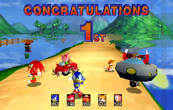
If you nab the Chaos Emeralds and claim first place, you get to keep the emeralds (which is much easier than it sounds, as the AI is so slow you can take your time hunting down these items and still end up lapping them). Collect every Chaos Emerald to unlock Super Sonic. Meanwhile, if you can collect all five coins on a stage in a single race, and get in at least third place, you’ll race one of the robot doppelgängers. Beat the metallic lookalike in their race and you unlock them. And for the curious, the fifth stage is unlocked simply by claiming first place in the four starting stages, with Robotnik being unlock upon victory in said secret stage.

But Diddy Kong Racing this is not. While these hidden goodies sound enticing in theory, the utterly chaotic, unfinished nature of the game itself makes their addition mean nothing. It’s like having sprinkles without the ice cream. And the implementation of these items is so half-assed anyway that you can unlock everything in about a half hour.

Some variety in the racetracks is attempted by means of having different aesthetic settings for the courses (such as nighttime or winter, the latter of which freezing water), but they ultimately have a minimal effect on the gameplay, and only serve as an outdated showcase of the Saturn’s graphical capabilities. Apparently there wasn’t enough time to design more levels or polish the gameplay, but at least the developers found time to add rain effects to the courses.

The one element of Sonic R that I will admit is enjoyable is the music. Now, it isn’t genuinely awesome music as in the Genesis Sonic games. Rather, Sonic R’s soundtrack is when the music of the series began to enter “so bad it’s good” territories. Each race track comes equipped with a cheesy theme song with surprisingly high production values (a la the early seasons of the Pokemon dub) that may give you a bit of earworm.

“You’re winner!”

Sonic R was a bad game in its day, and its lack of quality has only been magnified in the years since its 1997 release. To say Sonic R failed at being a Mario Kart killer is a gross understatement. At the very least, Sonic can take solace knowing that he eventually found himself in one of the better Mario Kart clones in Sonic and Sega All-Stars Racing and its sequel. But the damage done by Sonic R was so great that it took Sonic and friends a good, long while before they reached that point (and even when they did, they were still ultimately not Mario Kart).

It’s hard to imagine how a Sonic racing game could go wrong, let alone this wrong. But Sonic R is indeed one of the worst racing games of all time.


2

Karate Champ (NES) Review

Just because a game helped shape a genre, doesn’t always mean it’s good. Sure, the likes of Super Mario Bros. and Tetris are timeless classics that remain entertaining even today, but not all influential games are so lucky. Look for no further proof than Karate Champ, a title which helped shape the fighting genre in its early days, before Street Fighter added depth and fun to the genre.

In Karate Champ’s defense, it probably fared a little better in its original arcade form, in which one or two players would take on their opponent using two different joysticks to perform moves. It still would lack substance, seeing as both fighters are identical in appearance (save for gi color) and moves, and there’s no deeper mechanics to speak of than “land the first hit.” But at least the moves might be at least a little responsive to the joystick controls.

I can’t say that’s the case for sure, seeing as I’ve never even seen a Karate Champ Arcade cabinet. But surely something was lost in the translation in bringing the game to the NES, because Karate Champ can be called nothing short of unplayable.

As stated, the battles really are as simple as landing the first hit to score a point. Score two points and you move on to the next fight. It’s basically just rinse and repeat from there, because every fight is exactly the same. The player (or player 1 if you’re exposing another human being to the game for some reason) is dressed in the white gi. While the CPU (or player 2) is in the red gi. The game couldn’t even be bothered to change the opponent’s gi color per level. The scenery changes (though each stage is just as ugly as the last), but that’s about it.

Things go from shallow to outright disastrous, however, once you try to control the game. Karate Champ on NES is up there with Bill & Ted’s Excellent Video Game Adventure, World Games (both also NES) and Dark Castle (Genesis) for the title of most uncontrollable game.

Simply put, you can’t control Karate Champ. You can press buttons, and the character will react, but there seems to be no rhyme or reason behind the action the character decides to make. You’ll walk towards your opponent and attack, only for the character to perform a leg sweep behind him. Or your enemy might get behind you, and you try to attack him by holding back on the D-pad and striking, only for your character to kick in front of him. It seems no matter what direction you’re holding or which button you press (both A and B perform attacks), the player has no say-so as to which action the character performs. Winning a match ultimately comes down to sheer luck then. I had my best performances simply by standing still and hitting one of the attack buttons once my opponent got close enough. It didn’t always work, of course, but it seemed to give me the best chance of actually landing an attack.

On top of all this, Karate Champ also suffers from some extreme technical issues. Sure, a lot of NES games are susceptible to such technical problems, but Karate Champ seems to constantly be plagued by graphical glitches, freeze-ups and crashes. These issues turn what is already a mechanically unplayable game into a technically unplayable one.

Perhaps the arcade versions of Karate Champ helped pave the way for the fighter, but no doubt pretty much everything that was created in its wake surpassed it by a great margin. And the NES port of Karate Champ may have actually devolved the experience all the more. At the very least, the two player mode may have you and a friend chuckling for a few minutes as you randomly swipe away at each other and see who manages to get lucky and actually hit the other. But it’s a short-lived joke, if anything. The bigger joke may just be how a game this broken eventually lead us to Street Fighter.


1

CrazyBus Review

In the darkest corners of the video gaming universe lie the most irredeemably horrendous titles. These are games so terrible, that referring to them as video games should contain an asterisk. Hong Kong ’97 lurks in these murkiest of depths, with its non-existent gameplay and utter disregard for basic decency. Sitting alongside Hong Kong ’97 – albeit for somewhat different reasons – is CrazyBus.

The very existence of CrazyBus is one of gaming’s great anomalies. CrazyBus was little more than a test by its mysterious Venezuelan creator to try out their computing skills. For reasons unknowable, the creator then self-released the game as  an unlicensed title… on the Sega Genesis… in 2004.

The most immediate of CrazyBus’ great sins is its soundtrack. As soon as you boot up the game, your ears will be bombarded with horrible noises lapping over each other in a chaotic attempt to produce music. It is the most cluttered, ear-assaulting noise you are bound to hear in any game (I use that word loosely here). I wish I could say I’m exaggerating, but the truth is any and all sounds that emanate from CrazyBus really are just terrible noises. No other bad gaming soundtrack I’ve ever heard even comes remotely close.

As for the “game” itself, well, it’s the single most shallow and empty experience you could possibly have on any gaming platform. You have a selection of Venezuelan buses to choose from (represented by heavily pixelated stock photos of said buses), and after you decide on your vehicle (all of which look like they were spat out of Microsoft Paint, and bear no resemblance to the photos on the select screen), it’s time to play the game.

You hold right on the D-pad. That’s it.

I wish I were joking, but that’s all CrazyBus is. You hold right on the D-Pad, and your visual-eyesore of a bus will go right and rack up points. These points, I might add, go outside of the point counter, and oftentimes can’t even be properly read, as their garish colors clash with the backgrounds (with these backgrounds also being stock photos of buses). The only other input the player has is to honk the horn on the bus, just in case you wanted any more audial abuse.

But here’s where things get downright laughable. You can instantaneously claim the game’s highest possible score (65,535 points) simply by pressing left on the D-pad at the start of your session. And that is that.

There is nothing more to CrazyBus. Though it’s understandable that someone would dabble with their novice programming skills just to see if they could make anything at all, it’s considerably less understandable that someone would then take such a test and actually self-release it. And how such an individual could imagine that the noise of CrazyBus constitutes music is dumbfounding.

Why was this released? And on the Sega Genesis in the mid-2000s, no less? There’s absolutely nothing to it as a game, its visuals are beyond ugly, and the noise that emanates from it is simply ungodly.

Even as an unlicensed title, why on Earth was CrazyBus ever released?


0

Deadly Towers Review

Few games are as unplayable as Deadly Towers. Though it was seen as a novel gaming experience back in 1987, retrospective looks have widely deemed it as the most frustrating game on the NES, and in some instances, the worst game on the console (and boy, is that saying something).

Deadly Towers is supposedly an action RPG, with players taking control of a warrior prince who’s out to destroy in evil force within the titular Deadly Towers by burning the “Seven Bells” in a sacred flame.

Problems immediately arise as soon as players step foot in said towers. Our hero has little health, moves at a snail’s pace (while enemies can move across the screen in an instant), and his only means of attack is by throwing swords (which he has a limitless supply of), with only one sword able to be thrown at a time. You have to wait until a sword passes through the screen or hits an enemy before you can throw another.

“Gotta love those puke-green walls!”

One of the biggest issues with Deadly Towers is that it’s beyond confusing. The tower in which the game takes place is an absolute maze. And of course there’s no map to speak of, so you’re just going from one garish room to another, hoping you’re making some kind of progress. This is made all the worse by the fact that you often can’t tell what is and isn’t a doorway to another room. Sure, there are a lot of entrances/exists that look as such. But just as frequently you’ll be walking near what appears to be a wall, only for the game to suddenly load another room. Worse still, there are some entrances to rooms that are marked by what I can only describe as scratches at the bottom of the screen, with these same scratches also marking many bottomless pits that lead to instant death! If that isn’t a cheap and poorly thought-out trap, I don’t know what is.

The enemies are an uninspired assortment of blobs, orbs and generic spider and bat monsters. As stated, they move much faster than our hero, and can often drain all of your health in a matter of seconds. In case that wasn’t bad enough, the enemies knock you backwards considerably whenever they make contact, which can send you into another room or off a cliff. I’m not exaggerating when I say I experienced multiple instances of getting knocked back by an enemy into another room, only for an enemy in that room to knock me into yet another room, with the process bouncing me around like a pinball until I died.

Perhaps the most infuriating aspect of Deadly Towers is that, upon death, you start all the way back at the beginning of the game! You do receive a password upon death (a password which, strangely, is already imputed, leaving the player only to press start), but these passwords are ultimately useless. You still start back at the beginning of the game, losing any money you’ve acquired along your journey. The only thing you retain is the boosted maximum health you gain by grabbing health-boosting power-ups. But here’s the kicker; you don’t start out at the new maximum health level. No matter how many health-boosters you pick up, you’ll always go back to the start of the game at 100 health. But hey, you can slowly farm enemies in the vain hope that they’ll drop enough hearts to get you to your new maximum health.

Deadly Towers is not a fun game to play: Between the slow character and attacks, swarms of enemies, labyrinthian level design, unknowable pathways, misleading traps, and constantly restarting the game, Deadly Towers is nothing short of a painful gaming experience. But it’s also butt-ugly to look at, with grossly colored environments being “complimented” by the aforementioned uninspired character designs. And the music is as obnoxious as anything else in the game, consisting of a single track of music that is not only constantly playing, but doesn’t even loop! Instead, the music starts over every single time you enter a new room, so get used to those first few notes. You’ll be hearing them a lot.

Longtime gamers often look back at gaming’s yesteryear with nothing but delight. That’s probably because they’re reflecting on the Super Marios and Mega Mans of gaming’s early years. But there’s also the ugly side to the retro gaming, especially when it comes to the 8-bit era (and the 32/64-bit generation). Gaming was still young, and there was plenty of experimentation to be done. While some of these ideas soared to greatness, others just feel archaic. But Deadly Towers is a game that feels so prototypical and unfinished in every way, that it might just be the poster boy for this uglier side to retro gaming.


1

Hydlide Review

At first glance, Hydlide might look like a blatant ripoff of The Legend of Zelda. It uses the same top-down perspective, you traverse a fantasy world filled with strange monsters and lush forests, and you have a sword, shield and magic spells at your disposal. But the truth is, the original Japanese PC version of Hydlide actually predates Zelda, though this NES version was released following in Zelda’s wake. Though don’t be fooled, just because Hydlide looks like Zelda doesn’t mean it shares any of that legendary series’ quality. Indeed, after playing Hydlide, it’s easy to imagine it predates Zelda, as it feels downright prototypical and unfinished even without considering the shadow of Legend of Zelda looming over it.

To more or less sum up the game’s overall unfinished nature, there’s no animation to speak of in regards to the player’s character. By holding the A button, you switch from Defense to Attack, and then you just walk into enemies. There’s no animation for swinging your sword or raising your shield. You just hold the button and look at the bottom of the screen to make sure you’re in the desired mode, and walk into enemies. Whether or not you’re damaging the enemy or the enemy is damaging you is anyone’s guess, so you’ll just have to keep looking at your health bar to make sure you’re not the one taking damage, or wait for the enemy to unceremoniously disappear, indicating your “hard earned” victory.

As stated, you can obtain some magic attacks as you progress through the game, but they’re hardly worth the effort involved in using them. You have to again hold down a button to switch to the desired spell, and then press the A button to enter attack mode, and press B while in attack mode to cast the spell. With the sheer abundance of enemies that often appear on-screen, coupled with the tediousness of casting the spells, means you’d rather just use the aforementioned method of charging into enemies and hoping for the best.

Perhaps even worse than the combat are the game’s cryptic puzzles. Actually, cryptic may be an understatement. The original Zelda on NES had cryptic elements (one of the reasons I don’t think it’s held up as well with time as its sequels). What we have here in Hydlide is beyond cryptic, like entering a castle in order to enter a lake (why not?), or hitting two wizards with a spell at the same time to be teleported to an island. These are the kind of things that have so little cohesive logic to their process that you would really need some background information to consider them. But of course, Hydlide gives you no such information or details. It’s a slog of an adventure that consists of one baffling puzzle after another, with none of them making any sort of sense, and having no information made available to fill you in on such preposterousness. Even when Zelda was at its most cryptic, it still gave you hints!

Of course, Hydlide is also the kind of game that starts you back at the very beginning if you die. But wait, there’s a password system! Before you get your hopes up that a password system might make the game a little more playable, it has to be the most convoluted password system imaginable. To save your progress, you have to bring up the menu and select the save option. That doesn’t save things right there, but instead gives you a password that isn’t immediately visible. After selecting save, you have to bring up the menu a second time and this time select the password option to see the password that the save option gave you. From there you can write the password down for later use, but of course the passwords have to be overly long, just to make an already tedious experience just that much more tedious.

Just in case you thought there might be a saving grace in the form of a catchy 8-bit soundtrack, the music is as uneventful as anything. There’s only one short loop that plays for the entirety of the game – from the moment you turn the console on until the last screen of the game – and it sounds like an ice cream truck knockoff of the Indiana Jones theme.

If anything, Hydlide does serve one purpose; and that’s to give players an even stronger appreciation for The Legend of Zelda. Though I think the original NES Zelda has aged in a number of ways (at least when compared to its “sister game” Super Mario Bros., which has better stood the test of time), it really did push the action/adventure genre forward in so many meaningful ways. Sure, the Zelda sequels expanded and redefined what an action/adventure game could be, but going back to a game like Hydlide – which came even before the first Zelda – and you can really see how clunky the genre was before Link took up his sword and donned a green tunic. The ambition for adventure was there, but developers clearly didn’t know how to bring adventure to life through the video game medium yet.

You could say Hydlide was some kind of prototype, and under such rough circumstances I guess I could say it isn’t the worst game I’ve played. But its status as a “Before Zelda” adventure title can’t save it from being a convoluted bore to play today.


1

Hong Kong ’97 Review

There are varying degrees of bad games. There are games with glaring flaws, but also boast enough redeeming qualities to make them worth a look. Then there are games that are mostly bad, but have a few qualities that show that, at one point, the game may have had some promise. After that there are games so bad you might get some entertainment out how hilariously terrible they are. Those are followed by games so atrocious that it’s no longer funny. They’re just flat-out broken.

Below all of that, we have Hong Kong ’97.

If you’ve never heard of it – something you should be thankful for, and I’m sorry if I’m serving as your introduction to it – there’s a good reason for that. Hong Kong ’97’s release is still one of gaming’s great mysteries. All that’s known is that in 1995, a company known as HappySoft LTD desperately tried to get their one and only title into video game stores as an unofficial release on the Super Famicom (the Japanese Super Nintendo), but that few retailers (if any) would take it.

Years passed, and along came the internet, which allowed gamers to finally satisfy whatever sick curiosity they may have had for the game. Whether through questionable downloading, or by indie retailers putting the game on an SNES cartridge as some kind of joke, people were finally able to see exactly why no one wanted to sell it to begin with. Hong Kong ’97 is abysmal in every regard.

Honestly, Hong Kong ’97 is difficult to describe in mere words. Just about every aspect of the game is as baffling and absurd as they are atrociously designed. But this is a review, so we have to give it a shot.

First, let’s start with the music. As soon as you start the game (and I mean as soon as you start the game), you are bombarded with a five-second loop of the Chinese song “I Love Beijing Tiananmen” repeatedly. It never stops. Through the opening cutscene to a game over, and everything in between, the first two lines of I Love Beijing Tiananmen are constantly looped, without any break or pause under any circumstance. Also, it’s the only element of sound in the game, as there are no other music tracks, and zero sound effects to speak of.

As dumbfounding as this audio “quality” is, it’s actually the least of Hong Kong ’97’s slip-ups. Next, let’s talk about that notorious opening cinematic.

“Desperate much?”

After multiple screens of text asking retailers that HappySoft will buy and sell games, you are introduced to the “story” of the game. In 1997, the Transfer of Sovereignty over Hong Kong from the United Kingdom to China is taking place (an accurate prediction on the game’s part). To counter the threat of Chinese rule, the Hong Kong government assigns Chin (represented by a stock photo of Jackie Chan) – an unspecified relative of Bruce Lee – to wipe out “All 1.2 billion f***in’ ugly reds.”

Wait, that’s not all.

To combat Chin, the Chinese government is researching a means to take the deceased Chinese leader Tong Shao Ping (represented by a stock photo of real-life, former Chinese leader Deng Xiaoping, who was still alive at the time of the game’s release), and transform him into an “ultimate weapon.”

My words simply can’t do this intro justice. This opening cinematic is just so absurd on so many levels that it has to be seen to be believed.

“This picture is beyond a thousand words.”

After the opening, the “game” immediately and abruptly begins without warning. Players take control of Chin in what basically looks like a parody of the shoot-em-up genre. Chin throws nonspecific white balls at enemies, who appear from the top of the screen. Occasionally, car enemies will appear from the sides of the screen. Defeat three cars (something that takes about a minute and a half), and the “ultimate weapon” Tong Shao Ping appears (still little more than the same photo of Deng Xiaoping’s head from the intro). Defeat Tong Shao Ping, and everything starts over. The gameplay (I use that word very loosely) is just an asinine, endless loop, much like the music.

Weirder still, the backgrounds that the action takes place on are all random stock photos, ranging from Maoist propaganda to the Coca-Cola logo (of which I doubt Coco-Cola gave any consent).

The bizarre visuals don’t stop there. Every enemy you defeat turns into a poorly-cropped photo of a nuclear explosion, with Tong Shao Ping exploding into dozens of square-contained mushroom clouds. It’s downright laughable.

Oh, and should you get hit even once, you are immediately (IMMEDIATELY) taken to the game over screen, which has got to be Hong Kong ’97’s most tasteless element (and that’s saying something).

Hong Kong ’97’s game over screen is notorious for showing what appears to be a real-life crime scene photo of a body, due to the date and time being featured in the corner of the picture (though the horrendous pixelation makes it difficult to discern the more graphic aspects of the photo, thankfully). Call me overly sensitive, but this isn’t a history book or something where the use of such a photo would have any kind of context. Having a photo like this in a game is just distasteful.

After the offensive game over screen, you go back to the opening of the game (the part where HappySoft is desperate to buy and sell games). You can speed up the screens of the intro, but you can’t skip it outright. Get hit just once and you have to view it all over again.

There’s really nothing else to say. As a game, Hong Kong ’97 is as poorly-designed as they come. It doesn’t have any redeeming qualities. It’s empty, shallow and broken. But what makes Hong Kong ’97 all the worse is how distasteful it is: the desperate advertising in the opening, using brand logos and celebrity likenesses without any permission, and worst of all, using what is probably a real photo of a violent crime scene as a game over screen make Hong Kong ’97 a “game” that knows no shame.

Up until this point, my rating scale has remained a 1 through 10 system. But Hong Kong ’97 has broken me and my rating system. Hong Kong ’97 deserves nothing more than nothing.


0

Where’s Waldo (NES) Review

Where’s Waldo? on the NES is 8-bit Hell. It’s a game so fundamentally flawed and aesthetically unpleasing that it has to rank as one of the worst video games of all time.

For those unfamiliar, Where’s Waldo were a series of picture books which featured complex images featuring the titular character of Waldo hidden amongst the countless other characters and goings-on on the page. Though his candy cane-striped shirt, cap and coke bottle glasses may lead you to think he’d stand out like a sore thumb, the books were really creative in how they hid the character on each page, with plenty of other characters and objects sharing at least one similar trait to Waldo, to throw the reader off.

The books were a lot of fun, but they don’t exactly scream to be translated into video game form. But that’s just what happened on the NES in 1991, and it was a chaotic mess. But don’t take my word for it, just look at a screenshot of the game.

“Good lord, where IS Waldo?! Where is anything?!”

Under any circumstance, this would be one of the absolute ugliest NES games ever. But this is a case where bad graphics actually do equal a bad game, because the whole point is to find Waldo. But how can you tell what anything is when it looks like this?!

Most of the stages use this setup, and players have to find Waldo by hovering a square cursor over different sections of the picture, and selecting where they think Waldo is. If they find Waldo, they move on to the next stage. If not, time is taken away from the countdown timer. If the time reaches zero, it’s game over. Of course, you can’t pause the game at any point, to ensure you don’t cheat.

At the very least, Where’s Waldo? tried to take advantage of the medium in just about the only way it could, with Waldo switching locations in every playthrough. Something a stagnant picture in a book couldn’t accomplish. Not that it really matters, when the game itself makes finding Waldo an unfair situation with its horrendous visuals.

The game features three different difficulty settings, with the harder difficulties giving you less time, a smaller square, and bigger pictures with more characters.

Players are given a fair amount of time to find Waldo, so you might think about just randomly clicking everywhere until you find him. But that won’t serve you any good in the long run, because the time limit isn’t set to each level, but for the whole game.

As it is, Where’s Waldo would already be an abysmal game, but it’s this time limit for the whole game that really kills it, because the developers were seemingly sadistic in finding ways to cheapen this aspect.

You may notice when starting up the game that Waldo is holding a countdown timer…which is already ticking down. That’s right, before you even “play” the game, the clock is already running. But the worst part of it all is that, in between stages, you are taken to a map screen where Waldo walks to the next stage – where the player has no control and has no ability to skip – with the clock still counting down the whole time. And Waldo doesn’t simply walk to the next stage, either. Instead, he walks around aimlessly, zig-zagging all over the place before making his way to stages. It is an obnoxiously cheap trick that makes the game blatantly work against the player.

Where’s Waldo? does try its hand at some variety, with three of the game’s eight stages featuring different gameplay. But these stages may actually be worse than the rest of the game.

There’s a cave stage which is pitch black, with Waldo only showing up sporadically for the player to find them. If they manage to do just that, players then take control of Waldo (complete with slippery controls) and guide him to the exit. An hourglass icon also appears when controlling Waldo, but it’s actually detrimental and takes away a good chunk of time. It’s not like it’s an enemy that chases Waldo, it shows up and looks like a power-up or something. So it’s basically just another cheap trick for first-time players.

Then there’s the subway stage which – good heavens above – is on par with the telephone booth segments from Bill and Ted’s Excellent Video Game Adventure as one of the most unnecessary, convoluted, and downright horrible stages in gaming history. Here’s another screenshot to give you an idea.

The goal of this stage is to guide that tiny, blue box (apparently a subway car) to Waldo and his glasses, and then work your way to the other side. The whole thing just looks like a jumbled mess, and because the game never has the courtesy to tell you what’s going on, I didn’t even realize you could change the directions of each space by pressing the B button until my fourth try. The worst part of this stage, however, is the character other than Waldo. This guy moves around the board, and if you come into contact with him, he will subtract from the timer at an absurd pace. You can blast through the previous stages in a minute’s time (dead serious), and this guy can eat up your remaining time in a brief second.

The final stage also changes things up…with a slot machine. The two slots on the sides move at a pace that you can time, but the middle slot moves so fast that getting all three slots to land on Waldo (the stage’s goal) is nothing more than an act of sheer luck. What’s worse, your cursor on this stage moves so slowly between the three buttons, that you’ll likely lose a lot of time going from one button to the next. It’s a disaster.

In case all this was telling enough about the game’s terrible quality, Where’s Waldo’s title screen features some of the most wretched, ear-piercing, headache-inducing “music” in video game history. So in case the game wasn’t hard enough on the eyes, it also assaults your ears.

Simple put, Where’s Waldo? belongs on a shortlist of history’s very worst video games. The Where’s Waldo? books may be colorful and fun, but the game is anything but.


1

Superman (NES) Review

Superman NES

Though video games based on licensed properties are always a bit of a gamble in terms of quality, comic book superheroes have faired a little better than most. There have been a number of good video games based on superheroes, and even sone great ones (mostly thanks to Batman). But this does not apply to Superman, who is seemingly cursed when it comes to making the transition into gaming.

Superman’s most notorious video game is his Nintendo 64 offering, which often ranks as one of the worst video games of all time. But good ol’ Superman was producing video game duds even before then, including a lackluster venture on the NES.

Superman on NES has to be one of the most boring games on the console. You play as Clark Kent, and can become Superman by entering phone booths. If you take too much damage, you revert back to Clark Kent.

Now, Clark can fight just as well as Superman (at least, as well as you can fight in this game), but only as Superman can you use your super powers, which include ice breath, flight and X-ray vision, among others.

The game is basically a sidescroller, with Clark/Supes able to jump and attack with the A and B buttons, respectively, and the select button using your assigned super power (which you can change via the pause menu). It sounds simple enough, but everything about the controls just feels way off.

The jumping is slow and floaty, and makes you feel like you’re jumping without gravity working against you. And the attack, well, I think it’s supposed to be a punch, but the animation doesn’t look any different from Clark Kent/Superman’s walk cycle, so it’s more of a nondescript lunge. What’s really weird is that if you keep punching while in the air, you’ll just stay in place. What really ruins the attack though is how awkward it is used against enemies. You can hit enemies without being particularly close to them, which makes the whole attack feel like a half-assed implementation.

Worse still are the super powers. The super powers can only be used in specific instances, with the flight ability being particularly head-scratching. Flight only works in particular areas, but there’s no visual indication as to where you can use it. If it works, you may fly to a different part of the map, or to the top of a building to fight more enemies. If it doesn’t work, you still have to watch Superman fly upward and then come back down, even though nothing comes of it. So you’re usually just wasting the flight power watching the same piece of animation over and over, and you’ll probably only effectively use it out of pure luck.

I can understand that the abilities are meant to be situational (though it would be nice to use at least some of them outside of their specific situations), but the game fails to give you any idea when you should use the super powers. It’s annoyingly cryptic.

Not that it would matter too much anyway, as the gameplay that is present just feels so flat and boring. You just walk around Metropolis and punch(?) bad guys, and not much else. There’s no fluidity to the controls, and the gameplay is never engaging.

To add insult to injury, there’s not a single NPC in the game that says anything even remotely helpful. The people of Metropolis are apparently the simplest people on Earth, as they’re only capable of saying short sentences that have no meaning. What’s worse is that the text appears so slowly, that even their shortest lines take an unnecessary amount of time.

On top of all of this, the game is just downright ugly, probably one of the worst-looking games on the NES. The characters have a cartoonishly stumpy look to them, which was probably the result of rushing the game, as opposed to any attempt at a novel art direction for the property. The colors are garish, and the backgrounds bland. It’s just a very ugly game. Complimenting the ugly visuals is a ghastly, irritating soundtrack (the game never even bothers making a synthesized attempt at John Williams’ Superman theme).

Superman on NES is one of the worst games on the system, though it currently ranks as the second-worst game to star the Man of Steel. It’s so boring and so bland. There’s nothing ‘super’ about it.


1

Dark Castle Review

Dark Castle

Dark Castle is unquestionably the worst game on the Sega Genesis, and equals – and perhaps outdoes – Bill and Ted’s Excellent Video Game Adventure for the title of worst video game I’ve ever played. It’s that bad.

For starters, the game looks like one of the uglier 8-bit titles. It’s hard to believe it was released on the same console in the same year as Sonic the Hedgehog, which still looks colorful and vibrant today. Dark Castle is an ugly game that was visually outdated on its release.

Graphics are only the smallest of Dark Castle’s offenses, however. The most prominent, game-breaking flaw of Dark Castle are the controls. It is the worst controlling game I have ever played.

You play as some guy with a mullet in a green shirt, who controls so poorly he may outdo Lester the Unlikely as my most hated video game character. This dude can only pick up throwing rocks for weapons, and is the worst jumper in gaming history.

Jumping is performed by pressing the A button, but the dude can only jump forward, and there’s no way to change his jumping height or distance, which makes any platforming feel awkward and clunky. And to throw rocks, you have to tap the D-pad up or down to position his arm just right (it can be positioned in any 180-degree direction in front of him), and then press the C button to throw a rock. It is beyond tedious.

All the more baffling is his ducking ability. If you press down on the D-pad along with the B button, he ducks for a split second. If you want to keep ducking, you press up on the D-pad and B. Why on earth two different actions for ducking were necessary is beyond me, and holding the up direction in order to stay ducking is just confusing.

The control scheme itself is horrendously awkward, but it’s made all the worse by its execution. I can’t even begin to describe how off the controls feel with the character’s movements and actions. The character will continuously trip (seemingly over nothing), he’ll stop and get dizzy from falling two feet (leading you susceptible to enemies, all of which kill you in one hit). And falling any higher than that will kill you.

Then there are functions which don’t even seem to work. To climb on ropes, you have to jump towards them and hold up on the D-pad, but sometimes it just doesn’t work. You’ll also fall if you try to move from one rope to another too quickly. There are indiscernible dead-ends left and right, and sometimes there’s no definition between the foreground and background, with one wall in particular seemingly in the background, until you reach a certain point of it and it becomes something of a wall right in front of you.

Dark CastleWith the aforementioned abysmal controls for throwing rocks, it’s an immense chore just to hit enemies. Most of the enemies are generic bats and rats, which are so small you have to be on the pixel to hit them, but there are also some human enemies as well, as well as small gnome-like creatures that make the most obnoxious sound effect in video game history. All of these enemies move quickly and usually come in hordes. Not to mention they either respawn or get back up after mere seconds. In order to rotate the character’s arm to throw the rocks (already a tedious endeavor) the character has to stand perfectly still. Combine that with his constant dizziness and tripping, and you’re basically a sitting duck no matter where you go.

The controls alone already make the game a disaster. But to add insult to injury, the game also plays some unfair tricks on the player. I’ve already mentioned the confusing wall and quick-fire enemy respawns, but there’s more where that came from, including a dungeon area which you’ll be visiting time and time again.

The dungeon is just a single screen, with a man whipping prisoners at the bottom and rows of rats, bats and human enemies above. Rocks pass right through the whipping man, and in order to subdue him you need to grab a nearby flail and hit him with it (before you think this is a new weapon, you automatically drop it as soon as you knock the whip guy out, and you can’t pick it back up again). You need to get past the whip guy while he’s unconscious (which, again, only lasts a few seconds) so you can grab one of two nearby keys. If the whipping guy gets back up while you’re getting the key, you’re dead, because you can’t get past him. But what’s even worse is that one of the two keys – which have no visual distinction from each other – is a trap that will kill you, and it randomly changes each time you try to grab it. So you go through all that trouble for a mere guessing game that has a 50/50 chance of making you start over.

That’s not even the worst part about the dungeon. The worst thing about it is how often you’ll get there. It seems like just about every room in the blasted castle somehow has its own way of getting you back there. If you stand still for too long, the floor might fall from underneath you, and it’s back to the dungeon. Other times you might trip and fall into a pit, and it’s back to the dungeon. In perhaps the most aggravating example, if you take too long to get past certain rooms, a weird gargoyle/flying monkey will appear – which you can’t avoid – and will then grab you and drop you into the dungeon. Naturally the only way out of the dungeon is to somehow get past all the enemies above and leave via the upper right corner of the screen, in which case you need to backtrack several rooms to get back to where you were. You are honestly just better off resetting the game.

Other unfair elements include the rat enemies. Not only are they hard to hit with rocks, but sometimes you can walk past them without any problems, and other times they kill you. There is no way to tell when they will kill you, making the act of going passed them a gamble.

Dark CastlePerhaps Dark Castle’s most humorous blunder is its music. The sole piece of music in the entire game – from the title screen to the end – is just a looped segment of a synthesized version of Bach’s Toccata and Fugue in D Minor, which gets really old, really fast. You have the option of turning the music off in the pause menu, but here’s where things get really hilarious. You have to turn it off when a note isn’t playing to ensure you turn it off. If you turn it off during a note, that note will be sustained for either a short while, or until you turn the music back on and try again. Yes, you could play through the game with one long, continuous note through all of it. It is the most baffling audio slip-up I’ve ever heard in a game.

On top of that, the game’s sound effects are an assault on the ears. It seems every enemy is constantly bombarding you with insipid sounds, and the main character sounds like a total buffoon. If Dark Souls represents the pinnacle of video game sound effects, then Dark Castle sits at the exact opposite end of that spectrum.

If there’s any act of mercy to be found in Dark Castle, it’s that you can actually make the game considerably shorter right from the start. When the game begins, our idiotic hero stands in front of four doors, two with question marks above them, one with a shield, and one with the letters “BK” at the top (which apparently stands for ‘Black Knight’). Each door leads to a different section of the castle, though the whole thing is ultimately connected.

Normally, the two question mark doors are supposed to give you a fireball when completed, and the shield door gives you a shield, both of which are meant to make the final boss easier. But if you just go to the BK door, you only have three screens to worry about, the third of which is the encounter with the Black Knight (who fights you by throwing his never-ending supply of beer mugs at you, making him the goofiest final boss imaginable).

Still, even if you shorten the suffering, playing Dark Castle is still suffering. Its abysmal controls, lack of clarity, unfair obstacles, annoying sounds, blatantly unfinished elements, ugly graphics and all-around poor game design make it one of the worst video games of all time.


1

Bill & Ted’s Excellent Video Game Adventure Review

Bill & Ted

Bill & Ted’s Excellent Video Game Adventure on the NES may very well be the worst video game I have ever played. It’s right up there with Wizard of Oz on SNES and Superman 64. It’s a game that’s so bad, that I can’t even begin to comprehend how anyone involved with it could have thought any of its aspects were anywhere near finished. It’s a broken, unplayable disaster.

The game serves as something of a sequel to the 1980s comedy Bill & Ted’s Excellent Adventure. The film was not exactly a classic, but it’s a fondly remembered and pretty entertaining comedy about two idiots (Bill and Ted, obviously) who are about to fail their history exams, and go back in time to find historical figures to help out with said history exam.

It’s not the worst concept for a movie to be turned into a video game, but boy, the execution is nothing short of abysmal.

In this video game quasi-sequel, Bill and Ted are informed that space-time rebels have gone back in time and put historical figures in different time periods. Why they did this is anybody’s guess, but the grand crescendo of this crime is that it means Bill and Ted’s band, the Wyld Stallyns, will miss their big concert that will make them big stars in the future. Bill and Ted are then sent back in time to restore the historical figures to their proper time.

Here’s where things go completely off-the-rails. Like in the movie, Bill and Ted travel through time via phone booth, so there’s an in-game phonebook to flip through featuring the different historical figures and their phone numbers (don’t ask why Cleopatra would have a phone).

Now, you would think that this would work like a stage select screen. You’d call a number, and go to that level. But that’s asking for way too much from this game. You still have to go through the levels in a linear order (making the whole phonebook kind of pointless), with the only time period you can even travel to at any given time being the one with a blinking phone number under the normal phone number (making these phone numbers utterly pointless as well). What is the point of any of this?!

"The most pointless segment of any video game I can remember."
“The most pointless segment of any video game I can remember.”

After you dial the number, you aren’t taken right into the level (of course you’re not). Instead, you go to some bizarre mini-game where the phone booth bounces around the place, and you have to try to navigate it to reach the numbers that match the phone number you just dialed! Again, I have to ask why this was even remotely necessary.

It is possible for this section to play itself if you wait long enough (again, pointless), but that takes away some of your coins, which are required to dial future numbers.

If you actually have the patience to make it into the stage, you are thrown into a somewhat isometric viewpoint, with the stages in a 45 degree slant. Words cannot describe how awful the controls are here. Walking on the pathways feels so incredibly awkward. Your character seems to walk around all over the place when you’re just trying to go in a single direction.

What’s worse is if you get off the pathways. Sometimes, you can walk just fine when going off the path. Other times, you are stuck in place, and have to continuously jump to get back on the path. But being off the path means your jumping distance is greatly reduced, and you fall flat on your ass whenever you land. It is an unnecessary hassle that defies all reason in the realm of video games.

So how do you find the historical figures? By luring them out with bait, which take the forms of different objects based on whatever figure you’re currently after. You find this “bait” by randomly jumping around the place. You can find it by jumping on the path, off the path, on a rock, on a tree, it doesn’t matter. You have no visual or audio cues as to where the objects are, you just keep jumping like a madman and hope to get lucky.

"Okay, now which way is south???"
“Okay, now which way is south???”

You can talk to passersby to get hints about where to find the bait, but the hints are as useless as anything else in this game. People will tell you to search in directions like north or south, which doesn’t help in the slightest as there’s no map or compass, and again, the stages are in 45 degree slants, so good luck figuring out which way’s which. They’ll also tell you things like “look around the four rocks” even if there are multiple quartets of rocks on the stage. It’s nothing short of atrocious that the developers would think any of these “hints” could possibly help the player.

To make matters even worse, you talk to people by running into them, but many of these people will also punish you for running into them by taking coins or throwing you in jail (which you can simply walk out of, but still). And of course there’s no variety between NPCs in a stage, so you just run into them hoping they’ll help out (not that they really help, anyway).

Even worse still, there are some NPCs that chase after you, and if they catch up, they’ll throw you in jail for the hell of it, which becomes a recurring nuisance. You can slow these grabby-hands down by throwing your coins, which distracts them, but again, you need the coins. Or you can temporarily send every NPC on the stage into a dance craze if you find a cassette tape and throw it on the ground.

On the subject of music, the game has an entirely forgettable soundtrack, and the music awkwardly stops after a single loop (though “escaping” from jail will lead to another loop). And to top it all off, it’s just a really ugly game to look at, with eyesore environments and indefinable characters.

I wish I could accurately describe just how truly horrible this game is. Every one of its aspects could be described as a crime against game design. It’s broken, cryptic, clunky, awkward, ugly, and it’s dumber than Bill and Ted ever were.

The only thing “excellent” about Bill & Ted’s Excellent Video Game Adventure is how excellently it out-sucks just about any other bad game I’ve ever played.


1